Short Profile Layout Styles
Please choose you preferred layout styles for your adoption profile book and fill out the style sheet form located in our shared Dropbox folder! Keep in mind- these are not templates for you to select from, but rather, a way for you to communicate your preferred style with me!
As you view these samples think about the quality and orientation of your cover photo, because these play a big role in determining what we will ultimately be able to create for you.
Layout Style 1
This layout is neatly ordered but still engaging! We paired warm, soft colors with warm, soft headline fonts. To keep it modern, we added a few clean fonts, a linear layout, and some fun glyphs. Traditional isn’t boring!
Layout Style 2
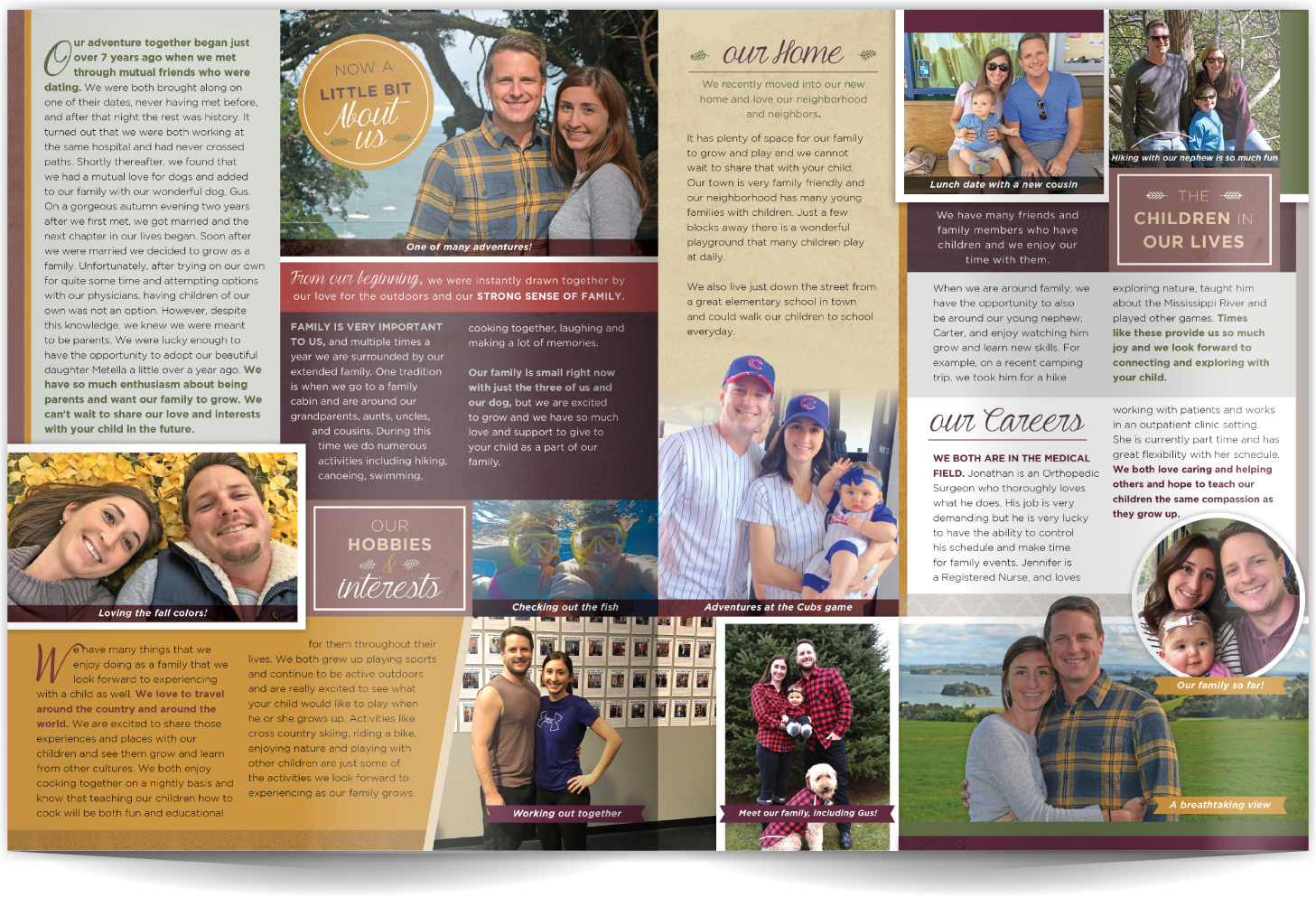
If you want your profile to be a fun as you are then this is a great layout style! We've incorporated hand-rendered sketches and playful type, plus the photos pop thanks to the marvelous, deep colors. Patterns, color, and graphic elements galore!
Layout Style 3
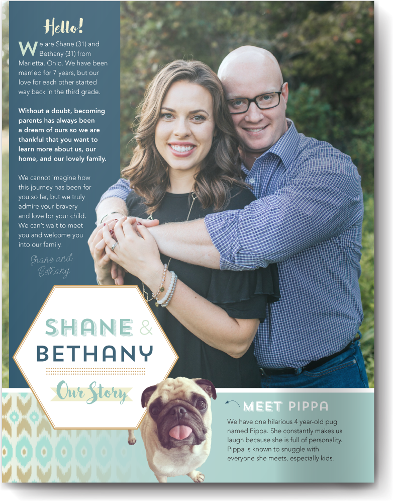
It can be hard to make a layout that's super-creative and fun that doesn't feel busy or overdone. This layout does just that! The trick is pairing modern styles and fonts with fun elements. Keeping the pattern linear helps the reader move across the page. We think this profile has a lovely beachy vibe, don't you?
Layout Style 4
Sleek, modern, and utterly amazing. This couple loved their super-clean layout that doesn't feel busy. Lots of white space on the page makes this layout easy to read and shares a clean style without feeling corporate. Just a few pops of bright color help jazz this mini profile up!
Layout Style 5
Style should always be reflective of your personalities and other essential parts of your story. We love the "badge" style typography paired with the modern neutral colors highlighted in this mini profile. The photo placement feels like a contemporary photo collage.
Layout Style 6
Patterns, rich colors and a varied-yet-linear layout work together to create a profile that's easy-to-read, fun, and shares lots of photos and text in an organized and engaging way. Pattern, fun typography, and layering elements are a great way to add dimension to a more modern layout.
Layout Style 7
Casual, warm and easy-going describes both this couple and their profile. Bold jewel tones showcase their great smiles and personality. Fun graphic elements take second chair to the photos and deep colors, but add warmth and a playful feel to the layout.
Layout Style 8
With this profile, soft neutrals and an easy-flowing layout invites the reader to stay awhile and get to know you. This profile balances white space with simple elements and a mix of fonts beautifully. Clean, elegant, and anything but boring! This is relaxed modern at its best.
Layout Style 9
The layout is simple but bold- the effect is exciting! We've mixed a bit of high-impact typography with intense colors for a fantastic first impression. A few high-quality photos mixed with everyday photos allow full-page photo layouts like this one. Pattern and color help showcase this happy family.
Layout Style 10
Contemporary yet playful with a dash of the outdoors- this layout uses a mix of neutral colors with high impact typography. We love the cutouts that take this profile to the next level. The type and design elements showcase this client's nature-loving lifestyle in a fun and modern way.


